Showing posts with label typography. Show all posts

Saturday, October 22, 2016

Re-drawing a company logo

Right: animation to demonstrate the construction of the banners. You can see the original logo flash by there as well.

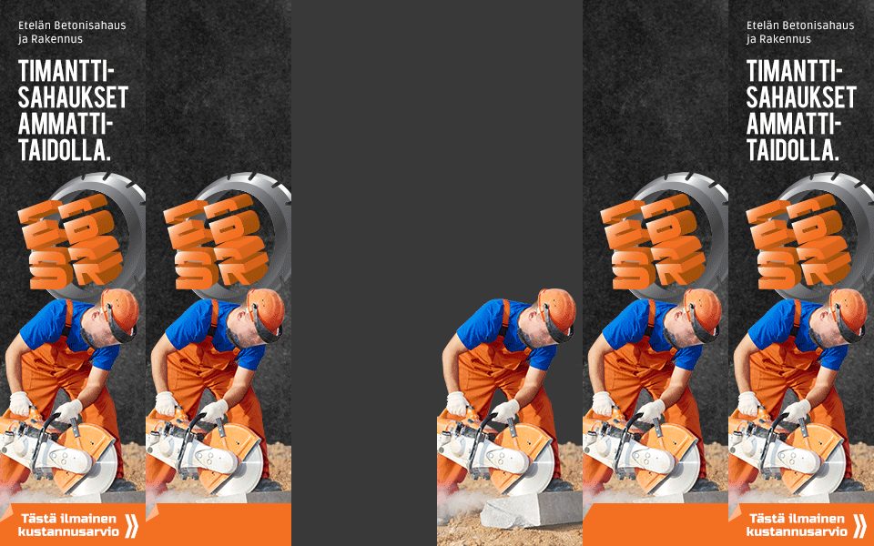
ESBR - logo for a campaign

For this campaign, along with creating the banners, I also took the opportunity to vectorize the client's hand illustrated logo by re-drawing the existing piece on Illustrator. This was for it to have a better impact and more professional appearance in the banners and for it to be more widely usable elsewhere as well, if ever needed.

For the banners themselves I used the overall dark base look from the client's homepage's, but substituted the rough gravel to a more refined dusty background.

For image, rather than using the provided manga illustration - which I felt was too 'niche' and could get dismissed by a lot of potential clients - I opted to use a similarly brightly color contrasted photo instead, to appeal to a wider audience.


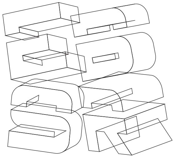
Above: before being converted and arranged to their tilted 3D-shapes the characters were drawn flat.

Tuesday, January 19, 2016

Lehtitehdas logo


Some years ago there was a hustle in getting the logo of printing house Salon Lehtitehdas re-newed. Simplified from the original (below right, designer unknown), the design features three offset press rollers, as well as a modernized typography, emulating some of the 'half round' anatomy of the originally used serif font.

Even though it's taken/taking a while for the new logo to get into wider use, I was instantly glad to get the old logo re-newed, simply so that it would better match the Salon Seudun Sanomat one it was/is often paired with (or in case of the companies' annual Christmas greetings would have been paired with, but I only started using their respective logos there side by side after the re-newal, previously opting to typing the names for more visually balanced whole).


Coordiration storetwitterinstagramfacebooktumblrpinterest

Saturday, January 9, 2016

Katujätkät logo


Logo design samples for Nuorisopalvelu Katujätkät Oy, organization dedicated to finding jobs and education for youth through apprenticeship positions.

Instead of the across running street in their original logo, the design features a more straight ahead leading street, which works both visually as a pleasingly dynamic element and symbolically for representing a forward leading career path. The logo also introduces two professional looking, steadfast standing "jätkät" figures ("guys" of the titular "street guys").


Saturday, December 19, 2015

Sea creatures of Japanese map

Sea creatures in shape of the Japanese map. Projects inspired by the distinctively ray shaped Hokkaido island I see whenever viewing the map of Japan.

The "prehistoric whale" painting below also employs the same shapes, with the East Asian shoreline forming the cloud pattern in the background. I did a slightly altered version of this as well, with a modern baleen whale type creature.

I'd also love to revisit the blue whale map (with island of Sakhalin as a 'shark') one day again; work it into a sort of 'kindergarden map poster', with further stylized characters and brighter colors.

Poster of the fish map is currently available in Coordiration store as both labeled and unlabeled versions.


Saturday, December 5, 2015

Kirjan Vuosi T-shirt design


T-shirt design for a "Book's Year" (Kirjan Vuosi 2015) campaign event aimed for kids. Part of an assingment for Turku University of Applied Sciences entrance exams: to sketch a T-shirt design and present an idea for an event to encourage reading in the audience group of one's choosing. With pre-school aged kids in mind I pitched an idea for a story book reading event and designed this shirt, which incorporates in it the actual official logo of the campaign year (lucky break there really; I could have had hard time coming up with a decent way of representing a book in circular shape in matching fashion with rest of the design *haha*).


Below are the entries for some of the assignments in the entrance exams for the Turku AMK "Bachelor of Culture and Arts" (medianomi) program, that got through to the second round in spring 2015. The assingnments were: 1 - as described above, 2 - to tell a story of a family's morning from the POV of dog, and 3 - to write down thoughts on the role and importance of the social media in marketing. One more of the assignments - campaign ideas for the international "Towel Day" - was previously presented here.


Thursday, November 12, 2015

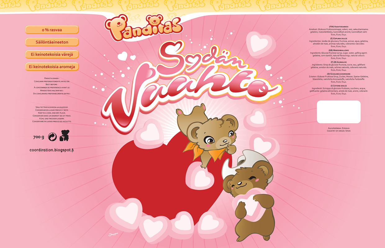
Panditas


Character, logo and packaging designs - including typography - for candy store Sweet Town's label Panditas (later "Dubbi").

Two large marshmallow bags got made - the "Paratiisivaahto" one above and the "Sydänvaahto" one below (with the blue cloud and the red heart as placeholders for the windows to be left clear on final products). Haven't seen these big bags around anymore in about a year (if anyone sees them somewhere, please let me know), but these little ones Sweet Town has in their own store bare the same graphics (excuse the crappy shot, but kinda exciting to have your package design hanging next to Rovio's Angry Birds *haha*).

Some time after the initial marshmallow bags, this purple licorice marshmallow one appeared in stores, decorated with a black variation of the "Panditas" bear someone had altered from my original illustration (as flattering as it is, this was done without consent, I'm afraid).


Panditas logo and usage guide. Unfortunately this logo never got used in the end - the name got changed before the packages went to production. I would later re-purpose this typeset style for the logo of my 're-imagining' of Lego's Fabuland project.


The actual bags - here you can see the windows in practice as well as the Panditas logo strip on the top of the bag re-designed and replaced by a third party after the name change to Dubbi. The Panditas, "little bears" couple - slightly cowboy themed "bandits".

Monday, November 9, 2015

Fabuland logo


In 2011 I was musing myself with the thought of revitalization of Lego's Fabuland series.

Though my set and packaging designs remain in unfinished state to this day, I did complete this logo for the series - one which I'm immensely fond of. Also drew few of the characters with a bit more modern touch to be used on box art and 'marketing'.