Showing posts with label flashback. Show all posts

Wednesday, January 13, 2016

SSS adverts


Selection of various ads for the newspaper Salon Seudun Sanomat, 2006-2014.

The Huiskula rose bouquet photo on the Mothers' Day campaign ad above left was an unfortunately late addition (layout considered). Below right: the most time consuming part of this otherwise fairly simple looking ad was the photo collage on the background, linking Salo landmarks and familiar scenery into one image.


Sunday, December 27, 2015

Rautia winter scenery


Used to regularly make ads for the hardware store Rautia for Salon Seudun Sanomat newspaper, from small front page pieces to more cumbersome whole spread 'collages'. However, this is the only one that stuck with me (no doubt because it required some more creativity than usual) and which I personally most care for: made this wintery mood image for their Christmas greeting by 'painting' some snow and ice on a summery stock photo from Kotitalo (one of their affiliate ready-made house manufacturers). It must have been running in their front page Christmas ad annually for at least 7 years now, iirc, maybe more. Most recently few days ago, this very Christmas.


Wednesday, December 23, 2015

Robin renewed

Somewhere from 2006 to 2007 my interests on hobby front took a turn from more manga inspired sources to American mainstream comics, and thus also artistic projects mainly concentrated around the DC comics' universe, and specifically within the 'Batman family'.

This is one of the works from that time. A geekish fact that I cherish here: this was likely the very first fan made artwork of the Robin's then new red and black outfit - hastily done overnight right after the first official images of the renewal went online, and published the very next day.

Inked pages for a Robin fan comic, 2007. True to the American mainstream comic form, the pages are empty of balloons and sound effects, which would be digitally added later in the production. For those with enough knowledge of the fandom and who might wonder: the characters depicted are the Robins Tim and Dick. As often the case, I seem to have exhausted myself with concentrating on minute details of the gear and surroundings: zippers, shoelaces, clothing seams, brand tags, street adverts and notice bills etc. (Tim appears to be wearing DC sneakers - fun detail I must congratulate my past self for *haha*).

Tuesday, December 22, 2015

Spirou - Piko

In 2007 I spent brief time revisiting beloved characters, that were - along with Asterix, Lucky Luke and Tintin - a staple part of library literature in childhood: Spirou and Fantasio. I've long wanted to do more with them still, but somehow just haven't gotten around to it... yet.

Above: "Home Again". Always thought Spirou's wardrobe should suit an active man. I liked the approach Janry had with him for more active wear, but most of that neglected the original look in all but coloring, and I liked to expand upon this with 'sporty wear' that would still reflect the look of the classic bellboy outfit by using familiar elements like the black stripes. Thus probably more time went into planning the gear in this piece (and otherwise), than drawing the actual image: this study for different styles of shoes for example - sneakers that would give the appearance of the character's original 'spats look' (which I always found a rather too formal wear for the kind of adventuring that went on in the comics). Fantasio's pink slippers are totally 'canon' though, and that doorway / livingroom configuration comes from Franquin's run on the comics.

Above: an idea after the cover of "Rayon Noir" by Janry. And a silly compilation I remember I gathered by flipping through all the Spirou albums, scanning and editing the separate images and putting them together... just to make a desktop I used maybe couple of weeks. Got a giggle out of it though. Below: subtle differences or just ridiculous standards? Red headed reporters / adventures, and shoe designs.

Loppuvuoden Salkkarit - subscription campaign


One of my personal favourites of the countless subscription campaign cards made for the daily newspaper Salon Seudun Sanomat over the years. Featuring characters slightly deviating in style from the usual "newspaper characters", with references to the paper's bear mascot, Otso Salkkari (the bear ears hat and the hair buns).


Friday, December 4, 2015

Petit Alice vol. 2


Layout and graphics for Petit Alice vol. 2, 2009 fanzine of Japanese street fashions stemming from the advent of popularity in the gothic & lolita culture (hence the rather 'gothic' title - not my design).

What to do with a whole spread reserved for events and only few to report - whole spread illustration. I'm oddly fond of the treatment of the header here still, despite it's age.

Thursday, November 12, 2015

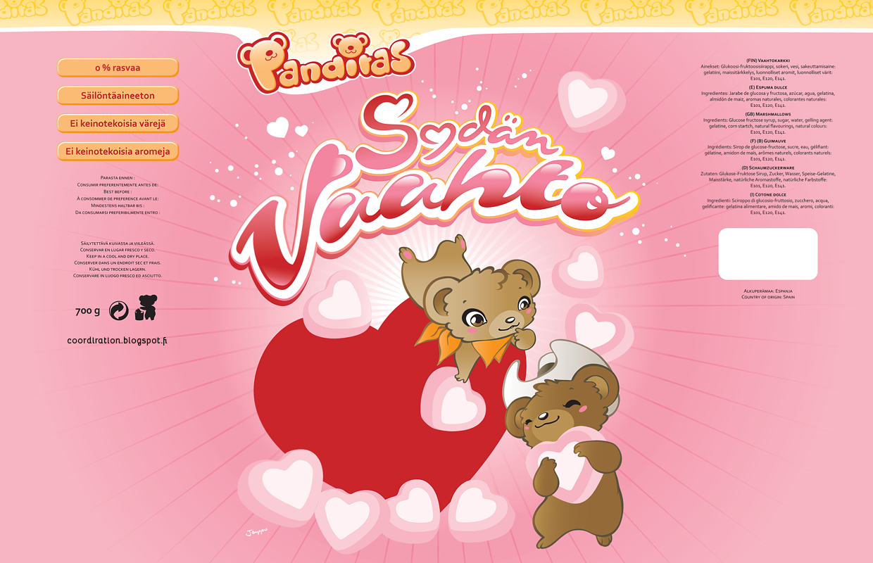
Panditas


Character, logo and packaging designs - including typography - for candy store Sweet Town's label Panditas (later "Dubbi").

Two large marshmallow bags got made - the "Paratiisivaahto" one above and the "Sydänvaahto" one below (with the blue cloud and the red heart as placeholders for the windows to be left clear on final products). Haven't seen these big bags around anymore in about a year (if anyone sees them somewhere, please let me know), but these little ones Sweet Town has in their own store bare the same graphics (excuse the crappy shot, but kinda exciting to have your package design hanging next to Rovio's Angry Birds *haha*).

Some time after the initial marshmallow bags, this purple licorice marshmallow one appeared in stores, decorated with a black variation of the "Panditas" bear someone had altered from my original illustration (as flattering as it is, this was done without consent, I'm afraid).


Panditas logo and usage guide. Unfortunately this logo never got used in the end - the name got changed before the packages went to production. I would later re-purpose this typeset style for the logo of my 're-imagining' of Lego's Fabuland project.


The actual bags - here you can see the windows in practice as well as the Panditas logo strip on the top of the bag re-designed and replaced by a third party after the name change to Dubbi. The Panditas, "little bears" couple - slightly cowboy themed "bandits".

Sweet Town


Candy store SweetTown's paper bag. The ship you see floating in the background was modelled after none other than the world's largest cruise ship, Royal Caribbean's Allure of the Seas (and her sister Oasis), that was getting build right next door to me on the Perno ship yards in time of this illustration's conception. I've used the ship on numerous other projects afterwards as my go-to backdrop ship (latest of which was for this very recent sailor themed Hello Kitty shirt - the most prominent appearance of it thus far as well).


My biggest regrets with these visually has always been, that I didn't dare redesign the original logo enough - only retouched a bit what someone else had created - and even more, that I didn't replace the used Dom Casual typeset entirely - thought it would be useful to keep to somewhat tie in with the store's existing brand image material, and for the ease of compatibility, if issues arose somewhere along the production line (one of the things you come too aware of wwhen orking in a position with loads of ads coming in every day, each using their own set of obscure designer fonts).

Sweet Town's current bags, while not my design, still use some of the elements I drew (without consent, I must point out) in a stylistic hodgepodge with other 'clip art'. I do like the new logo typeset much better though. Also have had couple of these 'moments' on public transportation and around the town: nothing more gratifying than seeing your product is getting used *haha*


125 x 90 mm sized ads for newspaper print. As usual with small businesses, there's quite a lot of info to scramble in an affordable ad space. It has its own certain kind of satisfaction and challenge I've grown to like to get something pretty done of such 'tight mess', and I often compare it to playing Tetris - every piece has to fit in just so without much if any white space to spare.


One of the characters I never got to introduce - a giraffe, I figured would've been well suited to promote the store's high quality. These projects left me with a pretty sizable library of sweets and snacks elements, which I've been yearning to put to some further use. Beginnings of title and box art for "Monkey's Daydream" (chocolate banana candies iirc) and an illustration for a mixed toffees bag.


"Lakrissa" I called the first of the characters I came up with, a liquorice legged cat. Then came "Ape", and "Nuts" was the squirrel's name 'unofficially' (not that any of the names were anyhow 'official' anywhere outside my own head anyway).