Layout designs and visual guidelines for Salon Seudun Sanomat marketing ads, to coincide with the newspaper's reformatting from broadsheet to a new tabloid size.
Showing posts with label layout. Show all posts
Sunday, April 3, 2016
Wednesday, January 20, 2016
Hobby profile graphics

A hobby profile page layout for linking to toy photo galleries on flickr. Back when Bricklink still supported more coding on their "About me" pages.
Tuesday, January 19, 2016
Kebab menu brochure
Cleaning up appearances for a local kebab pizzeria (above). Kebab restaurants and pizza places shoving their take-out menus down people's mail would really benefit from well executed appearance as well. Give me something pretty and I'm more likely to keep it and have it around when needed. I'm afraid, I would not like to hang this original scribble (below) on my fridge door for example.
Labels:
advertising,
brand image,
campaign design,
graphic design,
layout
Saturday, January 9, 2016
Katujätkät logo
Logo design samples for Nuorisopalvelu Katujätkät Oy, organization dedicated to finding jobs and education for youth through apprenticeship positions.
Instead of the across running street in their original logo, the design features a more straight ahead leading street, which works both visually as a pleasingly dynamic element and symbolically for representing a forward leading career path. The logo also introduces two professional looking, steadfast standing "jätkät" figures ("guys" of the titular "street guys").
Labels:
brand image,
graphic design,
layout,
logo design,
typography,
vector art
Wednesday, December 23, 2015
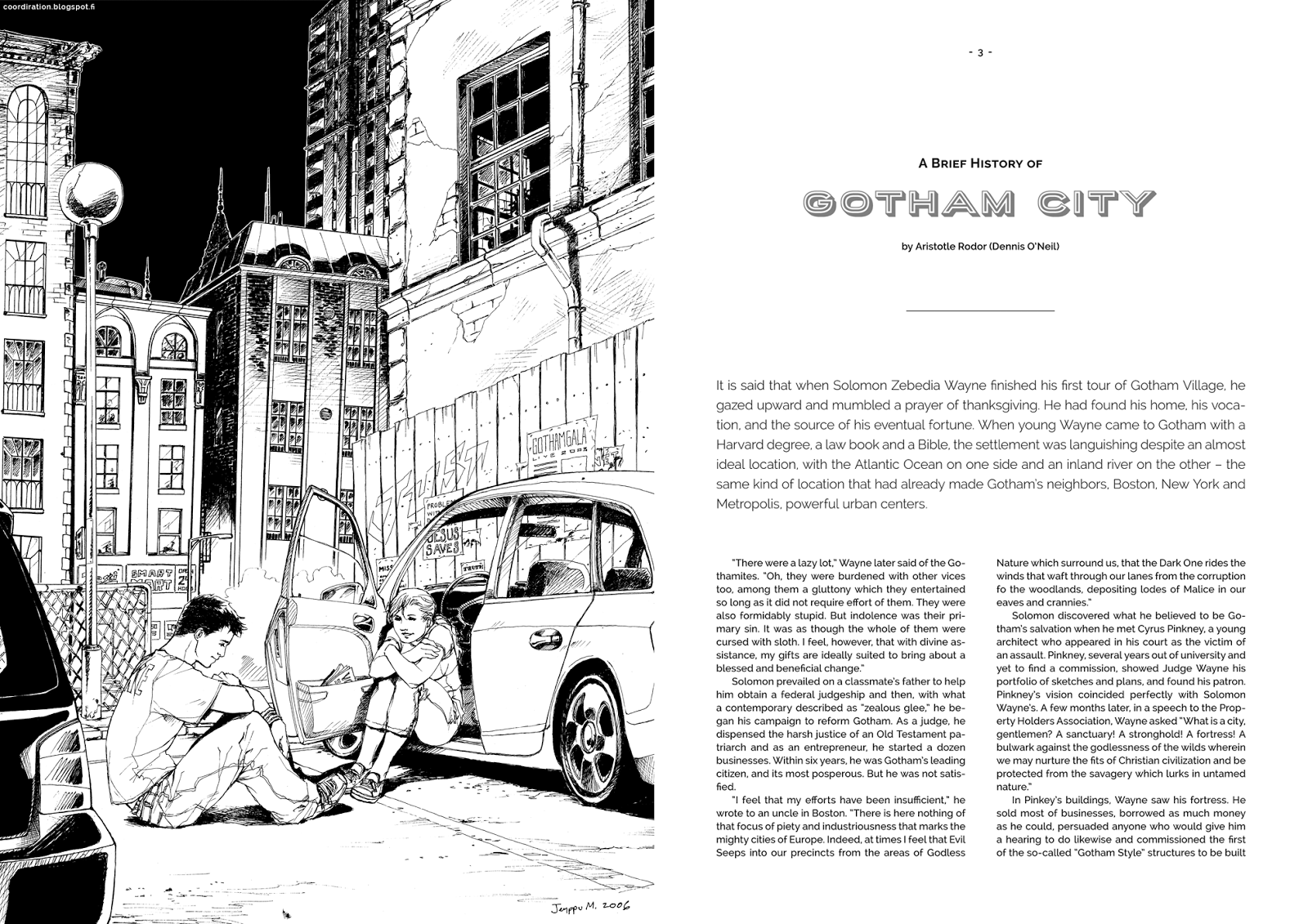
Gotham urban scenery
Mockup of a supposed artbook (or an in universe 'photobook' maybe?) to display illustrations from the world of Batman, 2006 - 2007. One of the most fascinating aspects of the Batman universe was always the city of Gotham itself, which occasionally took center stage over the characters in drawings during the time I was active within the fandom.
Below: Jason Todd (the 2nd Robin) on top of a Gotham high-rise. Drawn on A2 sized paper. I'm amazed of my past self with the details on this one: the readable billboards ("Zesti Cola", "Fuji", "Premier"...), the statues on the buildings and the Aparo Expressway bridge on the far background (as seen on further detail in a drawing below). This also includes a little easter-egg: Batman, surrounded by a flock of bats, watching over the whole scene on top of the pointy tower building, only really visible in the line art before colors. Jason's "Rebel Kind" shirt is also a callback to the Batman / Detective comics from the 80's, where such a poster can be seen on the wall of his 'hideout'.
Above middle: IIRC, this was my last 'proper' Batman piece before interest in the fandom faded in the advent of DC Comics' continuity altering event, "52". Appropriately titled "Last Summer". Never got around coloring this, but I do love the ridiculous details again. Characters depicted are Tim and Steph. Above bottom: Aparo Expressway. I remember always trying to pinpoint the exact location the scenes in my drawings took place on the map of Gotham that DC provided with some of their comics (a curious observation about the appearance of that map over here btw). Somewhere there was an expressway named after artist Jim Aparo. This is actually supposed to be a Nightwing fan art of sorts - as you can 'clearly' see, there's a tiny creature sitting on the beams of the bridge there: that's Dick Grayson, the first Robin, aka Nightwing later in life. Some of the details on this piece too can only be seen by getting close enough and brightening the image, like the distant harbour silhouette, lights of a passing ship on the horizon, or the writings on the posters (callbacks to minor details in existing comics too).
Labels:
Batman,
character design,
drawing,
fan art,
graphic design,
illustration,
layout,
page layout
Tuesday, December 22, 2015
Loppuvuoden Salkkarit - subscription campaign
One of my personal favourites of the countless subscription campaign cards made for the daily newspaper Salon Seudun Sanomat over the years. Featuring characters slightly deviating in style from the usual "newspaper characters", with references to the paper's bear mascot, Otso Salkkari (the bear ears hat and the hair buns).
Saturday, December 5, 2015
Kirjan Vuosi T-shirt design
T-shirt design for a "Book's Year" (Kirjan Vuosi 2015) campaign event aimed for kids. Part of an assingment for Turku University of Applied Sciences entrance exams: to sketch a T-shirt design and present an idea for an event to encourage reading in the audience group of one's choosing. With pre-school aged kids in mind I pitched an idea for a story book reading event and designed this shirt, which incorporates in it the actual official logo of the campaign year (lucky break there really; I could have had hard time coming up with a decent way of representing a book in circular shape in matching fashion with rest of the design *haha*).
Below are the entries for some of the assignments in the entrance exams for the Turku AMK "Bachelor of Culture and Arts" (medianomi) program, that got through to the second round in spring 2015. The assingnments were: 1 - as described above, 2 - to tell a story of a family's morning from the POV of dog, and 3 - to write down thoughts on the role and importance of the social media in marketing. One more of the assignments - campaign ideas for the international "Towel Day" - was previously presented here.
Friday, December 4, 2015
Petit Alice vol. 2
Layout and graphics for Petit Alice vol. 2, 2009 fanzine of Japanese street fashions stemming from the advent of popularity in the gothic & lolita culture (hence the rather 'gothic' title - not my design).
What to do with a whole spread reserved for events and only few to report - whole spread illustration. I'm oddly fond of the treatment of the header here still, despite it's age.
Labels:
flashback,
graphic design,
illustration,
layout,
logo design,
page layout,
photoedit,
vector art
Subscribe to:
Posts (Atom)