Showing posts with label advertising. Show all posts
Wednesday, November 12, 2025
Saturday, October 22, 2016
Billiard hall logo
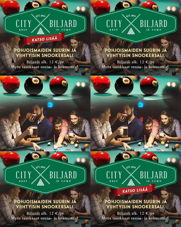
Creating a look for a pool hall campaign
Here the client didn't appear to have one constant logo or one particular brand image across any of their marketing materials, so I had free hands to create them one for their banner campaign.
For a while I had been wanting to take my shot at the currently widely popular style of the 'hipster X' logo, and here the advertised establishment's window decals provided me the idea and a chance to have at it.
Here the client didn't appear to have one constant logo or one particular brand image across any of their marketing materials, so I had free hands to create them one for their banner campaign.
For a while I had been wanting to take my shot at the currently widely popular style of the 'hipster X' logo, and here the advertised establishment's window decals provided me the idea and a chance to have at it.
Labels:
advertising,
banner,
brand image,
campaign design,
construction,
logo design,
Routa,
work
More original web campaign designs
Campaign designs
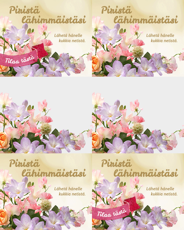
The animations on the samples are to illustrate the construction of the banners.
Some more examples of web campaigns with little or no material provided, where I had free hands to design the look for the banners.
The animations on the samples are to illustrate the construction of the banners.
Labels:
advertising,
banner,
campaign design,
construction,
photoshop,
Routa,
web design,
work
Re-drawing a company logo
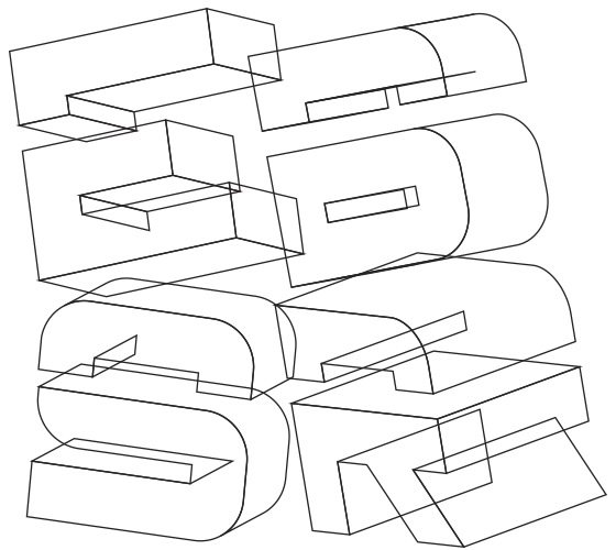
ESBR - logo for a campaign
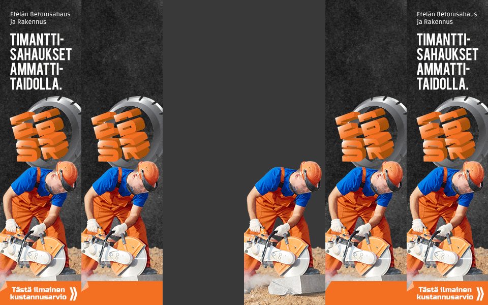
For this campaign, along with creating the banners, I also took the opportunity to vectorize the client's hand illustrated logo by re-drawing the existing piece on Illustrator. This was for it to have a better impact and more professional appearance in the banners and for it to be more widely usable elsewhere as well, if ever needed.
For the banners themselves I used the overall dark base look from the client's homepage's, but substituted the rough gravel to a more refined dusty background.
For image, rather than using the provided manga illustration - which I felt was too 'niche' and could get dismissed by a lot of potential clients - I opted to use a similarly brightly color contrasted photo instead, to appeal to a wider audience.
For this campaign, along with creating the banners, I also took the opportunity to vectorize the client's hand illustrated logo by re-drawing the existing piece on Illustrator. This was for it to have a better impact and more professional appearance in the banners and for it to be more widely usable elsewhere as well, if ever needed.
For the banners themselves I used the overall dark base look from the client's homepage's, but substituted the rough gravel to a more refined dusty background.
For image, rather than using the provided manga illustration - which I felt was too 'niche' and could get dismissed by a lot of potential clients - I opted to use a similarly brightly color contrasted photo instead, to appeal to a wider audience.
Above: before being converted and arranged to their tilted 3D-shapes the characters were drawn flat.
Labels:
advertising,
banner,
brand image,
campaign design,
construction,
Illustrator,
logo design,
photoshop,
Routa,
typography,
web design,
work
Friday, October 21, 2016
Pukuvuokrausta
Labels:
advertising,
banner,
brand image,
campaign design,
graphic design,
logo design,
photoshop,
Routa,
web design,
work
Banner campaign - Dueling hockey players
Labels:
advertising,
banner,
campaign design,
construction,
photoedit,
photomanipulation,
photoshop,
Routa,
web design,
work
Subscribe to:
Posts (Atom)