Showing posts with label TOP PICKS. Show all posts

Tuesday, October 25, 2016

Celebrations Street - Halloween box


Halloween treats box created for "Celebrations Street" Halloween series for the Coordiration store last year, and which turned out to be a surprisingly popular product. Here's a closer look of the layout and it's features.


Above: the texts on the box labels are fully editable to fit each customer's own intended purposes. To create the effect of elements going over the customizable type, the layers of the layout were saved in separate files, piled on several layers in the store system's own design tool and the type was then placed in between the wanted layers.
Below: the stripped out bottom layers of the layouts for the orange and 'dark' color choices.


Celebrations Street - Halloween

Customizable Halloween items in three coordinating colors for you to pick and choose your favorites to adorn your party. Selection of matching invitations, treats and candy, party favor boxes and gift bags, table settings, fabric, games and all the things you need for a terrific Halloween party!


Saturday, December 5, 2015

Kirjan Vuosi T-shirt design


T-shirt design for a "Book's Year" (Kirjan Vuosi 2015) campaign event aimed for kids. Part of an assingment for Turku University of Applied Sciences entrance exams: to sketch a T-shirt design and present an idea for an event to encourage reading in the audience group of one's choosing. With pre-school aged kids in mind I pitched an idea for a story book reading event and designed this shirt, which incorporates in it the actual official logo of the campaign year (lucky break there really; I could have had hard time coming up with a decent way of representing a book in circular shape in matching fashion with rest of the design *haha*).


Below are the entries for some of the assignments in the entrance exams for the Turku AMK "Bachelor of Culture and Arts" (medianomi) program, that got through to the second round in spring 2015. The assingnments were: 1 - as described above, 2 - to tell a story of a family's morning from the POV of dog, and 3 - to write down thoughts on the role and importance of the social media in marketing. One more of the assignments - campaign ideas for the international "Towel Day" - was previously presented here.


Thursday, November 12, 2015

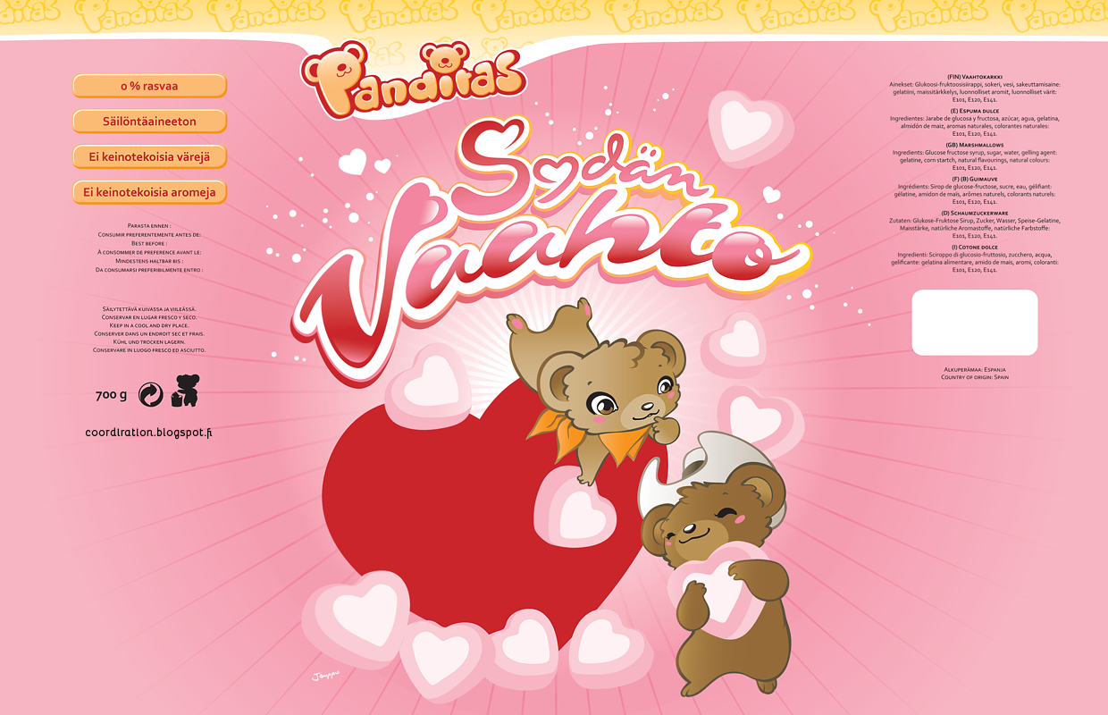
Panditas


Character, logo and packaging designs - including typography - for candy store Sweet Town's label Panditas (later "Dubbi").

Two large marshmallow bags got made - the "Paratiisivaahto" one above and the "Sydänvaahto" one below (with the blue cloud and the red heart as placeholders for the windows to be left clear on final products). Haven't seen these big bags around anymore in about a year (if anyone sees them somewhere, please let me know), but these little ones Sweet Town has in their own store bare the same graphics (excuse the crappy shot, but kinda exciting to have your package design hanging next to Rovio's Angry Birds *haha*).

Some time after the initial marshmallow bags, this purple licorice marshmallow one appeared in stores, decorated with a black variation of the "Panditas" bear someone had altered from my original illustration (as flattering as it is, this was done without consent, I'm afraid).


Panditas logo and usage guide. Unfortunately this logo never got used in the end - the name got changed before the packages went to production. I would later re-purpose this typeset style for the logo of my 're-imagining' of Lego's Fabuland project.


The actual bags - here you can see the windows in practice as well as the Panditas logo strip on the top of the bag re-designed and replaced by a third party after the name change to Dubbi. The Panditas, "little bears" couple - slightly cowboy themed "bandits".

Sweet Town


Candy store SweetTown's paper bag. The ship you see floating in the background was modelled after none other than the world's largest cruise ship, Royal Caribbean's Allure of the Seas (and her sister Oasis), that was getting build right next door to me on the Perno ship yards in time of this illustration's conception. I've used the ship on numerous other projects afterwards as my go-to backdrop ship (latest of which was for this very recent sailor themed Hello Kitty shirt - the most prominent appearance of it thus far as well).


My biggest regrets with these visually has always been, that I didn't dare redesign the original logo enough - only retouched a bit what someone else had created - and even more, that I didn't replace the used Dom Casual typeset entirely - thought it would be useful to keep to somewhat tie in with the store's existing brand image material, and for the ease of compatibility, if issues arose somewhere along the production line (one of the things you come too aware of wwhen orking in a position with loads of ads coming in every day, each using their own set of obscure designer fonts).

Sweet Town's current bags, while not my design, still use some of the elements I drew (without consent, I must point out) in a stylistic hodgepodge with other 'clip art'. I do like the new logo typeset much better though. Also have had couple of these 'moments' on public transportation and around the town: nothing more gratifying than seeing your product is getting used *haha*


125 x 90 mm sized ads for newspaper print. As usual with small businesses, there's quite a lot of info to scramble in an affordable ad space. It has its own certain kind of satisfaction and challenge I've grown to like to get something pretty done of such 'tight mess', and I often compare it to playing Tetris - every piece has to fit in just so without much if any white space to spare.


One of the characters I never got to introduce - a giraffe, I figured would've been well suited to promote the store's high quality. These projects left me with a pretty sizable library of sweets and snacks elements, which I've been yearning to put to some further use. Beginnings of title and box art for "Monkey's Daydream" (chocolate banana candies iirc) and an illustration for a mixed toffees bag.


"Lakrissa" I called the first of the characters I came up with, a liquorice legged cat. Then came "Ape", and "Nuts" was the squirrel's name 'unofficially' (not that any of the names were anyhow 'official' anywhere outside my own head anyway).

Monday, November 9, 2015

Fabuland logo


In 2011 I was musing myself with the thought of revitalization of Lego's Fabuland series.

Though my set and packaging designs remain in unfinished state to this day, I did complete this logo for the series - one which I'm immensely fond of. Also drew few of the characters with a bit more modern touch to be used on box art and 'marketing'.


Saturday, November 7, 2015

Kunnallislehti - uudistus


Attachment leaflet for the newspaper Kunnallislehti, marketing the paper's renewed look.

Images used are edited composites of the papers I photographed on my desk added together with "summer fresh salad displays" courtesy of the Salon Seudun Sanomat photo archive and the weekly "Keskiviikko Keittiö" column especially.


Salon Seudun Sanomat - Sanomalehtihahmot


"Sanomalehtihahmot" ("Newspaper characters") was the name I personally used of these 'stock characters' for Salon Seudun Sanomat company's brand image materials. Quick to modify and to put together, they were created to be used in various marketing materials in a moments notice (as was often the case). Featured in ads, page fillers, collaborational ad campaign designs, article illustrations, subscription campaign letters and cards, netbanners, the annual media info and price guide brochures, greetings and possibly even one wedding card as well (at least it was commissioned). The characters may also have spread out to other papers as I was leaving the company - last project with them was for a collaborational nationwide ad campaign for regional newspapers.


"Marriage of physical and digital papers"; couple decorating the covers of the annual SSS price guide brochures in 2013 and 2014.


The characters in page filler illustrations for real estate pages. I've always been oddly fond of the staircase one. Can't recall what the figure skating character was for.


Characters as "Paikallislehtiperhe" ("Local papers family") - to appear in various colors for each of the eight local newspapers under Salon Seudun Sanomat company. Characters voting on various elections over the years, and representing actual persons on a wedding invitation.


Scenes of price guide brochure illustrations and a gift subscription advert with SSS logo elements.


Characters appearing in various ad series: "SSS in daily life" TV-page fillers, front page ad space fillers and a nationwide ad campaign for regional newspapers.


Characters appearing in various ad series: "SSS in daily life" TV-page fillers, front page ad space fillers and a nationwide ad campaign for regional newspapers.


"Subscription help" for tilaajapalvelija.fi newspapers subscribtions service ads. The characters as "family Salonen" for a board game themed ad campaign for Salo local stores. In a springtime subscription offer campaign with SSS logo patterned flowerfield.


Characters appearing with readers in series of subscription campaign adverts.


The characters also made few world wide appearances completely outside their usual field of local newspapers and marketing, in strips of Lightning Made of Owls collaborative online comic project in 2009.