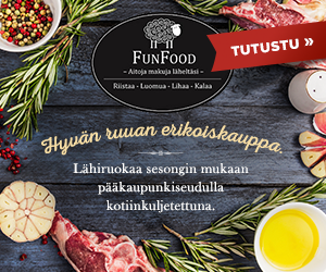
Campaign to advertise a delivery service for fresh food with logo as the material.


Campaign designs
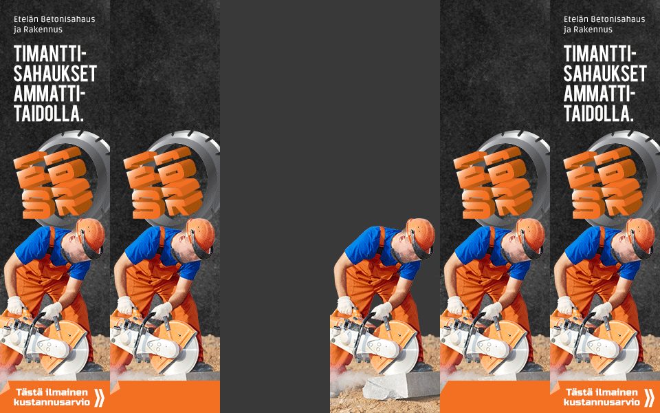
The animations on the samples are to illustrate the construction of the banners.
Some more examples of web campaigns with little or no material provided, where I had free hands to design the look for the banners.
The animations on the samples are to illustrate the construction of the banners.


Campaign for an online operated flower delivery service.



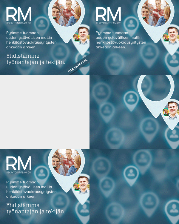
Campaign for a recruitment agency with logo as the material.