Showing posts with label logo design. Show all posts

Saturday, October 22, 2016

Billiard hall logo


Creating a look for a pool hall campaign

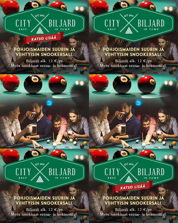
Here the client didn't appear to have one constant logo or one particular brand image across any of their marketing materials, so I had free hands to create them one for their banner campaign.

For a while I had been wanting to take my shot at the currently widely popular style of the 'hipster X' logo, and here the advertised establishment's window decals provided me the idea and a chance to have at it.


Re-drawing a company logo

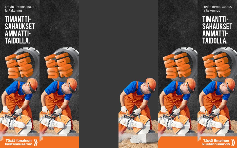
Right: animation to demonstrate the construction of the banners. You can see the original logo flash by there as well.


ESBR - logo for a campaign

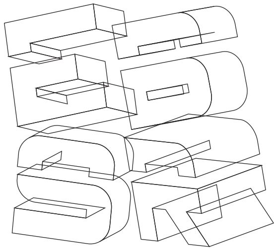
For this campaign, along with creating the banners, I also took the opportunity to vectorize the client's hand illustrated logo by re-drawing the existing piece on Illustrator. This was for it to have a better impact and more professional appearance in the banners and for it to be more widely usable elsewhere as well, if ever needed.

For the banners themselves I used the overall dark base look from the client's homepage's, but substituted the rough gravel to a more refined dusty background.

For image, rather than using the provided manga illustration - which I felt was too 'niche' and could get dismissed by a lot of potential clients - I opted to use a similarly brightly color contrasted photo instead, to appeal to a wider audience.


Above: before being converted and arranged to their tilted 3D-shapes the characters were drawn flat.

Friday, October 21, 2016

Sunday, April 3, 2016

Salon Seudun Sanomat reformat 2016


Layout designs and visual guidelines for Salon Seudun Sanomat marketing ads, to coincide with the newspaper's reformatting from broadsheet to a new tabloid size.


Tuesday, January 19, 2016

Lehtitehdas logo


Some years ago there was a hustle in getting the logo of printing house Salon Lehtitehdas re-newed. Simplified from the original (below right, designer unknown), the design features three offset press rollers, as well as a modernized typography, emulating some of the 'half round' anatomy of the originally used serif font.

Even though it's taken/taking a while for the new logo to get into wider use, I was instantly glad to get the old logo re-newed, simply so that it would better match the Salon Seudun Sanomat one it was/is often paired with (or in case of the companies' annual Christmas greetings would have been paired with, but I only started using their respective logos there side by side after the re-newal, previously opting to typing the names for more visually balanced whole).


Coordiration storetwitterinstagramfacebooktumblrpinterest