Saturday, October 22, 2016

Re-drawing a company logo

Right: animation to demonstrate the construction of the banners. You can see the original logo flash by there as well.


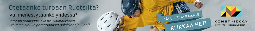
ESBR - logo for a campaign

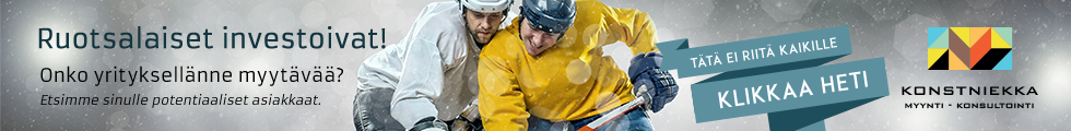
For this campaign, along with creating the banners, I also took the opportunity to vectorize the client's hand illustrated logo by re-drawing the existing piece on Illustrator. This was for it to have a better impact and more professional appearance in the banners and for it to be more widely usable elsewhere as well, if ever needed.

For the banners themselves I used the overall dark base look from the client's homepage's, but substituted the rough gravel to a more refined dusty background.

For image, rather than using the provided manga illustration - which I felt was too 'niche' and could get dismissed by a lot of potential clients - I opted to use a similarly brightly color contrasted photo instead, to appeal to a wider audience.


Above: before being converted and arranged to their tilted 3D- shapes the characters had to be drawn flat.


Coordiration storetwitterinstagramfacebooktumblrpinterest

Friday, October 21, 2016

Campaign for suit rental


New look for suit rental

Suomen Pukuvuokraamo, a company dedicated to renting suits and dresses, wanted a banner campaign specifically targeted to men. For this they requested a more masculine, "James Bond-ish" look for their banners.

To achieve a more sleek and refined look, I decided against using their provided logo - which seemed a bit too bridal for the intended target audience - and simplified it quite drastically. The images were from the suit brands and were chosen based on how well their color saturation could be toned down to fit the muted blue color scheme of the campaign.


My inspiration for the dark turquoise color scheme of the campaign was based on the "summer's trendiest suit color" - as mentioned by the client.

Coordiration storetwitterinstagramfacebooktumblrpinterest

Banner campaign - Konstniekka hockey players


The basic set of banners I've been working with at my job recently consists of three vastly differently shaped templates all within each created campaign. This in most normal cases requires the same material to perfectly fit all three of the bases, regardless of the original materials' orientation.


Top-most: the first proposed banner with the fighting hockey-players. Right: the final used image. Above: separate banner for the same campaign's 300 x 250 px slot.

This was a fun one to work on

Here I had to think about the motives of the action in the image I chose based on the campaign text, and how to emphasize the interraction between the characters in the available spaces. The original photo of the fighting hockey players, which I chose based on the provided text, presented the yellow shirted 'Swedish' player to be slightly less 'dominant' of the two, with the 'Finnish' guy beating on him, but the message on the banner was to be a rather provoking "do we let Swedes to beat us (on this given field)".

To get the message across within the image, I decided firstly crop it tightly to zoom in on the action and only show the most necessary bits as largely as possible. Then, in both cases I had to go in and change the arrangement of the elements in the image as well (especially radically in the case of the upright banner): turn the image so the yellow shirted fellow would loom over the other guy and even add a more clinched fist for him.

Quite cruesome task to work on in an imaginationary level in fact, but with visually striking results... actully too much so: in the end the campaign was changed to a bit less violent one and concentrated on the teamwork aspect of the game instead, with the two players equally displayed engaging in a fair match of hockey. Wise decision and a much more tasteful option, imho. And even if the work then went to 'waste', this was an inspiring practice in 'character manipulation' never the less.


Below are quick animated samples of the construction of each image / banner.


Coordiration storetwitterinstagramfacebooktumblrpinterest

Banner campaign - Ovesta

The banners created to improve the campaign's visual style.

Creating spaces

The basic set of banners I've been working with recently consists of three vastly differently shaped templates all within each campaign, and in most normal cases this requires editing any materials to perfectly fit both horizontal and vertical formats, regardless of the materials' original orientation. While the results may seem obvious and simple, the photomanipulation work that goes behind them can involve some spatially aware thinking and trickery. This case was a prime example of this.

In this case I was requested to improve the banners visually, using the same set of images as in the original banners.

To fit the chosen images perfectly for the both wide horizontal banner and the tall vertical one, I ended up cutting and pasting bits from different photos, and creating whole new 'spaces' as it were. The image of the appartment space spanning from the front door throught the whole apartment didn't actually excist, but was created for this banner alone from bits of different photos to appear as if one. The image in tall banner had to be extented up, and the ceiling created from a small patches of ceiling visible in the collection of images provided.


Animations to illustrate the construction of the banners.

Coordiration storetwitterinstagramfacebooktumblrpinterest