Wednesday, November 12, 2025
Tuesday, October 25, 2016
Celebrations Street - Halloween box
Halloween treats box created for "Celebrations Street" Halloween series for the Coordiration store last year, and which turned out to be a surprisingly popular product. Here's a closer look of the layout and it's features.
Above: the texts on the box labels are fully editable to fit each customer's own intended purposes. To create the effect of elements going over the customizable type, the layers of the layout were saved in separate files, piled on several layers in the store system's own design tool and the type was then placed in between the wanted layers.
Below: the stripped out bottom layers of the layouts for the orange and 'dark' color choices.
Below: the stripped out bottom layers of the layouts for the orange and 'dark' color choices.
Celebrations Street - Halloween
Customizable Halloween items in three coordinating colors for you to pick and choose your favorites to adorn your party. Selection of matching invitations, treats and candy, party favor boxes and gift bags, table settings, fabric, games and all the things you need for a terrific Halloween party!
Customizable Halloween items in three coordinating colors for you to pick and choose your favorites to adorn your party. Selection of matching invitations, treats and candy, party favor boxes and gift bags, table settings, fabric, games and all the things you need for a terrific Halloween party!
Saturday, October 22, 2016
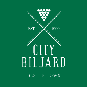
Billiard hall logo
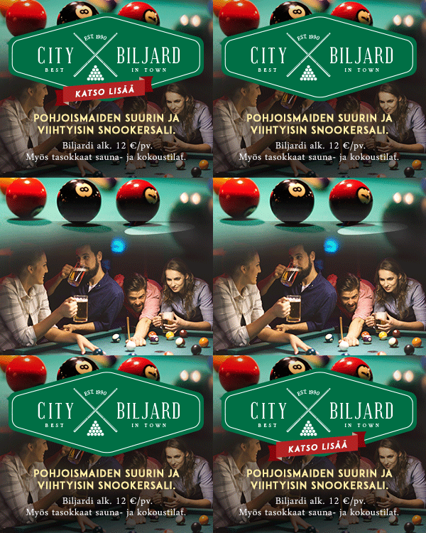
Creating a look for a pool hall campaign
Here the client didn't appear to have one constant logo or one particular brand image across any of their marketing materials, so I had free hands to create them one for their banner campaign.
For a while I had been wanting to take my shot at the currently widely popular style of the 'hipster X' logo, and here the advertised establishment's window decals provided me the idea and a chance to have at it.
Labels:
advertising,
banner,
brand image,
campaign design,
construction,
logo design,
Routa,
work
More original web campaign designs
Campaign designs
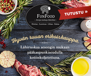
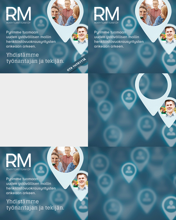
The animations on the samples are to illustrate the construction of the banners.
Some more examples of web campaigns with little or no material provided, where I had free hands to design the look for the banners.
The animations on the samples are to illustrate the construction of the banners.
Labels:
advertising,
banner,
campaign design,
construction,
photoshop,
Routa,
web design,
work
Original web campaign designs
Campaign designs
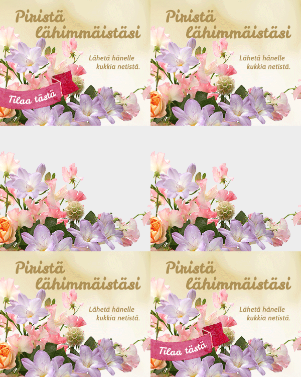
The animations on the samples are to illustrate the construction of the banners.
Some examples of the campaigns with little or no material provided, where I had free hands to design the look for the banners.
The animations on the samples are to illustrate the construction of the banners.
Labels:
banner,
campaign design,
construction,
photomanipulation,
Routa,
web design,
work
Subscribe to:
Comments (Atom)


